Implement user login experience
Key components that comprise your Immutable Passport front-end integration
- Guidance on sign-in button
- Guidance on sign-in alongside other authentication solutions
Default sign-in button
We have the following standard styles for the signup and signin button. Sign in button placement should be below the text instructing the user to sign in and large enough to be easily identified.
The text on your button should say “Sign in with Immutable” with a number of format options detailed below. You can download these SVG files and use as default buttons.
| When to use | In dark mode situations | In light mode situations |
|---|---|---|
| Default sign up and sign in experiences |  |  |
| In smaller spaces less than 300px width, you can use the logo lockup in button only however button should be proceded with the words "Sign in with" | Sign in with | Sign in with |
Our standard assets for building custom buttons
If you wish to create the above buttons in code, you should use the following official logos and styling guides.
| Sizing | 32px | 64px | 96px | 128px |
|---|---|---|---|---|
| SVG files |  |  |  |  |
The styling guides are in the below table:
| Theme | Example | |
|---|---|---|
| Dark |  | Fill: #F3F3F3 Height: 48px Width: 252px Radius: 48px Font: #131313 Roboto Medium |
| Light |  | Fill: #131313 Height: 48px Width: 252px Radius: 48px Font: #E1E1E1 Roboto Medium |
Alongside other authentication solutions
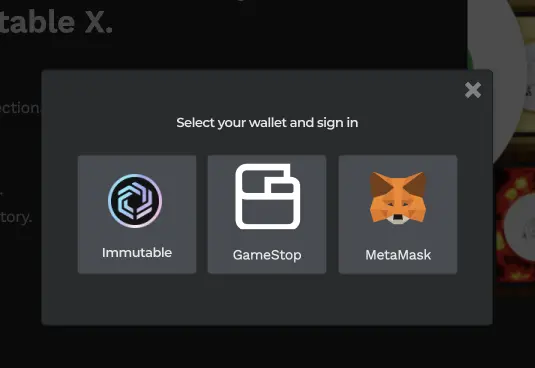
By exception, and upon review by our team, you may be able to modify the above default with your default style. We allow this based on your need to create multi-auth implementations. In these circumstances your Immutable Passport button implementation should be on par with the other wallet and authentication solutions you're providing.
| Vertical stack alongside other authentication providers | Button style horizontal layout |
|---|---|
 |  |
Monochrome Immutable logo options
| Options | Logo |
|---|---|
| Light background |  |
| Dark background |  |